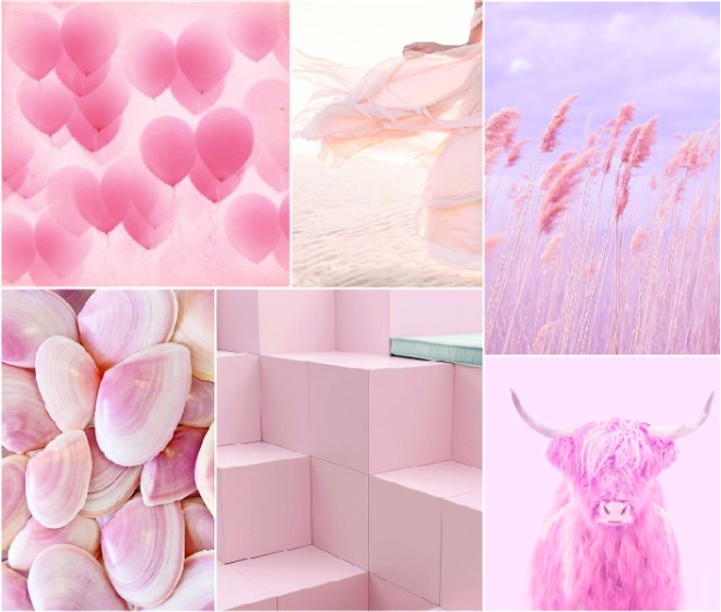

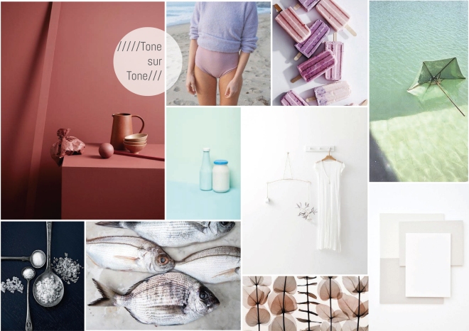
Today, pink is a usual suspect in gender stereotypes, as it’s often thought of as a “girly” colour. However, this was not always the prevailing belief. In fact, up until the 1930s, the pale red was thought of as a colour for boys: The bright red was a powerful colour usually associated with men, why the lighter version, pink, was used for the smaller men: The boys.
The colour pink origins in the ancient Greece, and as early as the famous works of Homer, the colour is described. It, naturally, has a place in art history, used to create the colour of white people’s skin, by mixing natural colour pigments of red and white to achieve the light tone. But when the artificial dyes were invented, the colour pink was on the rise. 1931 the Italian design Elsa Schiaparelli made it famous by inventing the variety “Shocking Pink”, the colour we today know as magenta. Pink found its place on the runway and the stars in musicals and has ever since been associated with feminity. And so the colour got its new association as the colour for girls, even though it used to be the opposite.
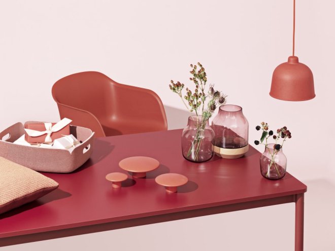
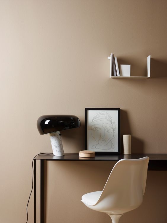
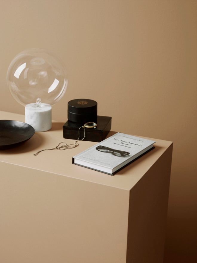
via FERM LIVING

Unfold Room Divider / Ferm Living new collection


 Poltona Klara
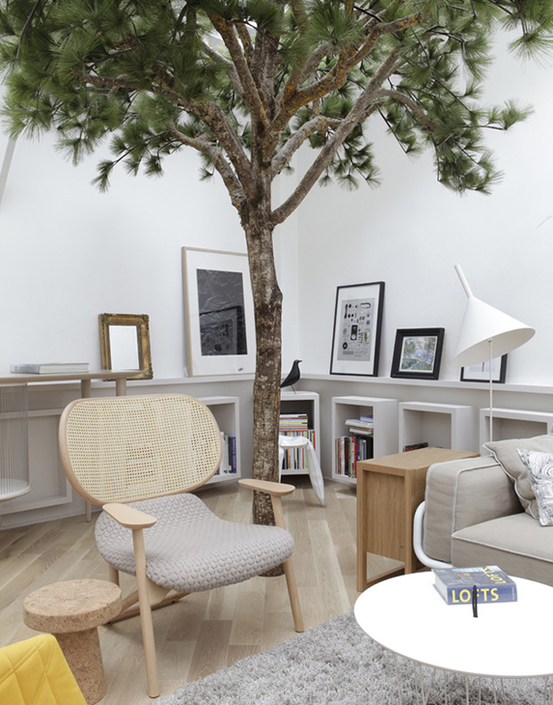 Rue Voltaire, Appartamento di 103m² Parigi, 2012.
 Allegory Desk, 2015
 Single Curve Stool,NENDO ,2015
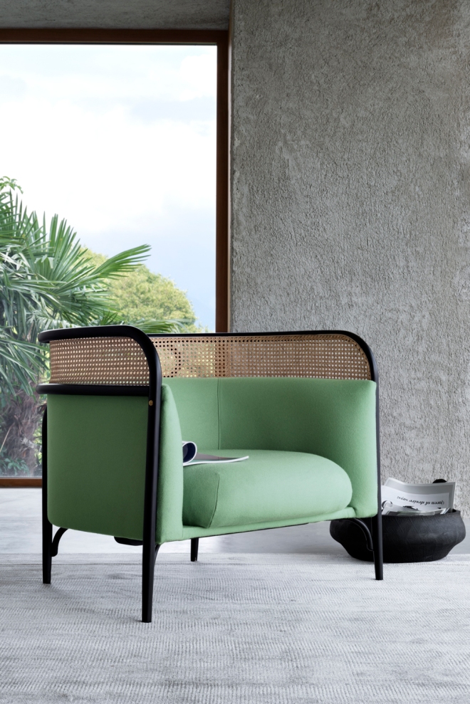
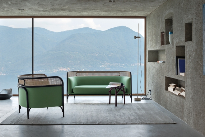 Targa Sofa, 2015


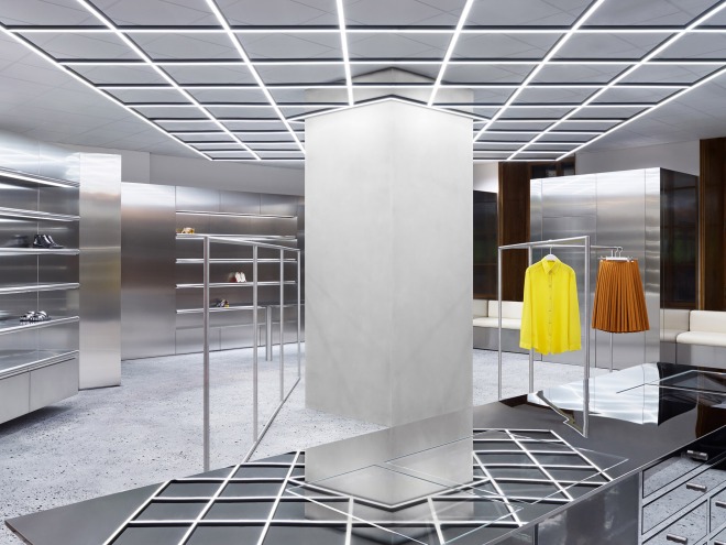


 Acne Studios, Concept & Design Direction Johannes Svartholm


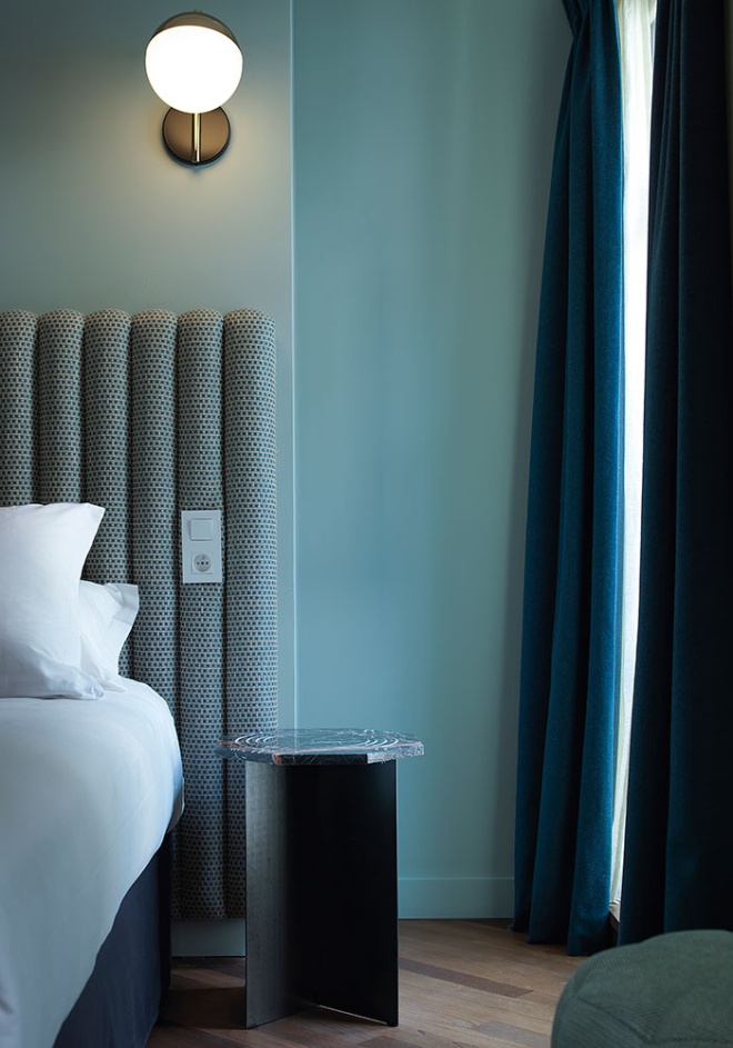
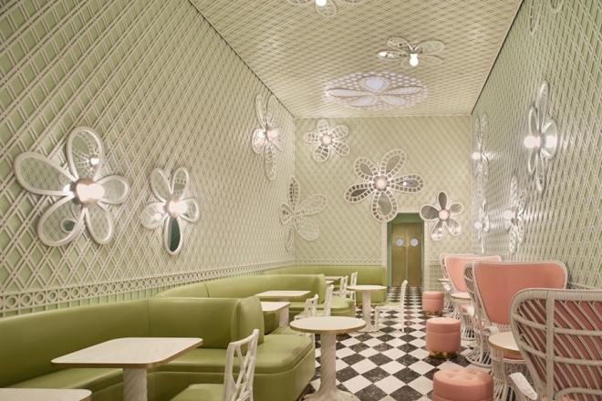
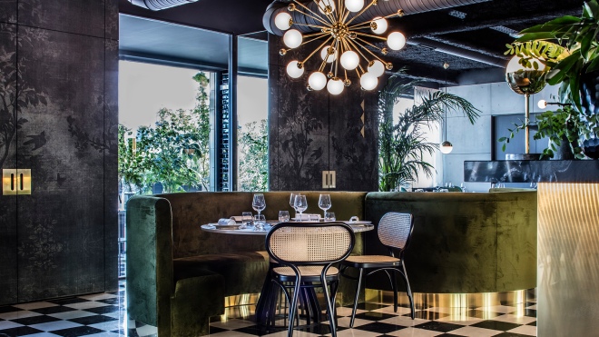
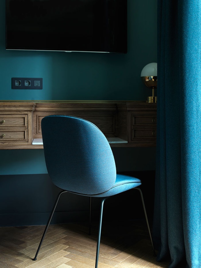 Hôtel bachaumont / photography: Paul Bowyer,Paris